We are just back from this year’s Dutch Design Week in Eindhoven in the Netherlands. Dutch design is outstanding and well known across the globe. So it is safe to say that the Netherlands have a certain design DNA similar to their northern neighbours in Scandinavia. Yet, Dutch design is standing out with its unique mix of cool, contemporary, playful, and experimental all at the same time. To get a better understanding and discover the latest green trends from Holland, we set off to a design weekend with a bunch of 15 European design bloggers. Buckle up, here we go!
Our first stop was something like the cell of Dutch design – the breeding ground for young design talents, the Design Academy Eindhoven. Bachelor and master students presented their works on several levels and many of the results floated somewhere between product design, art, and installation. Think of lots of conceptual work with a story behind. We didn’t spot anything particularly green, but you can see some of Judith’s favorites on her blog JOELIX.com.
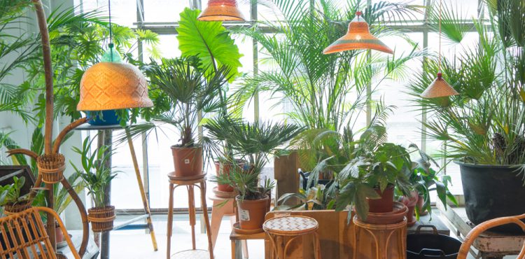
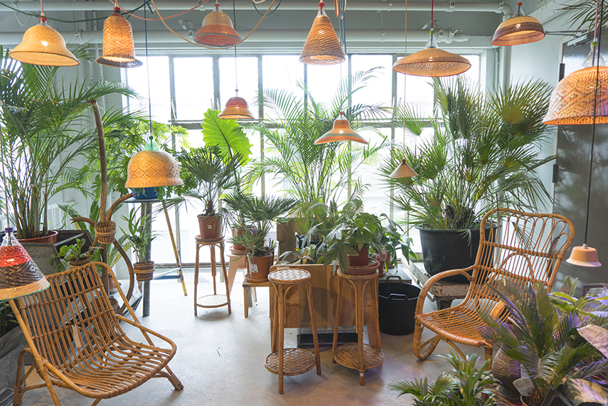
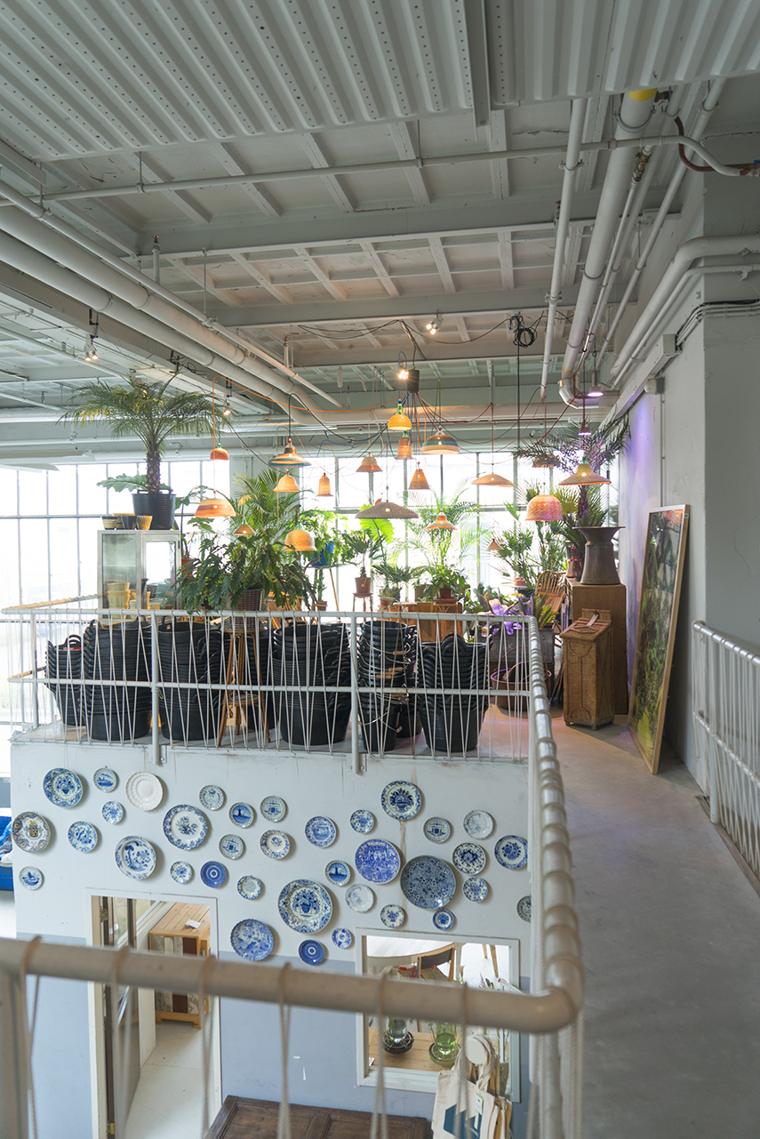
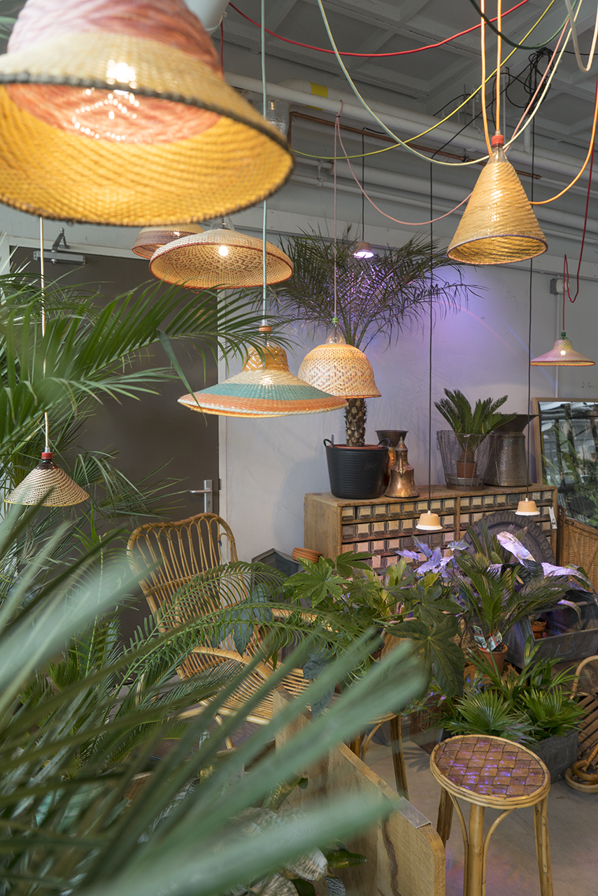
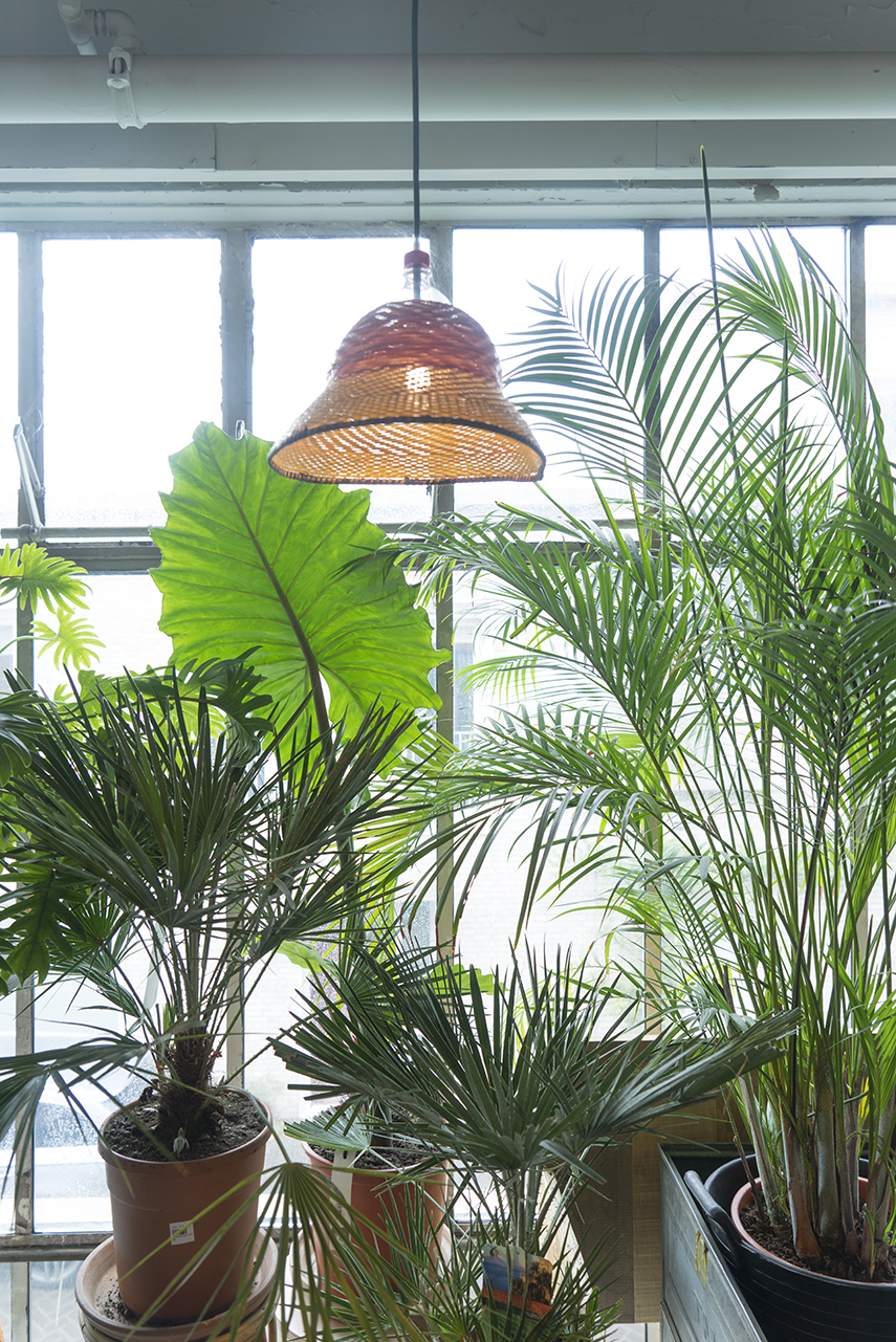
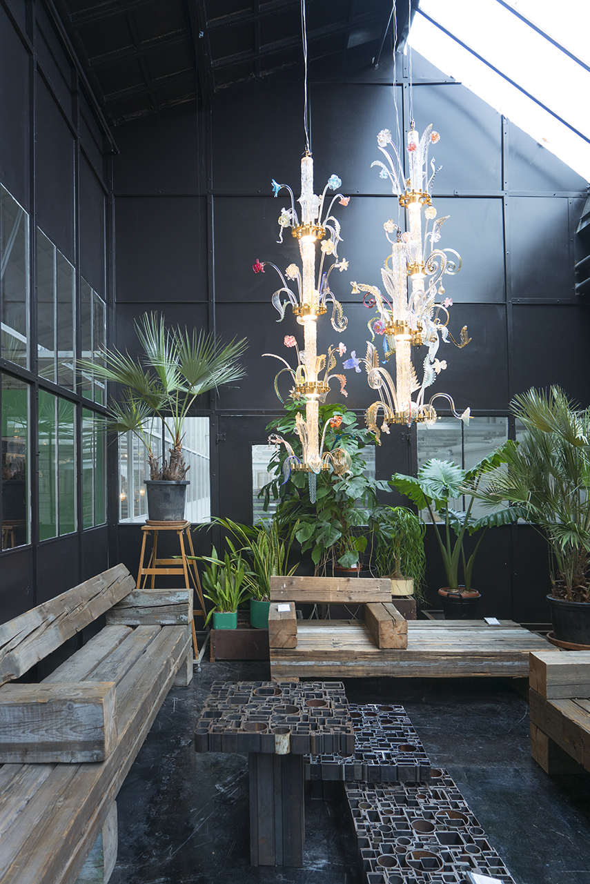
Another highlight of our design tour was the headquarters of Dutch design icon Piet Hein Eek. The philosophy of Piet Hein Eek to avoid any waste and to recycle and repurpose materials resonates with our understanding of a green and sustainable life. No wonder that the showroom and shop was packed with plants! And the plants seemed to perfectly act as a backdrop for beautiful design pieces like the famous Scrapwood dining tables, repurposed wooden benches for a green patio, as well as lamps and home accessories made of natural materials. Here again, it was more the green context that caught our eye than any specific green design. But the Piet Hein Eek headquarters hosted also several levels of exhibitors, among them young design labels with very cool green designs. Let’s have a look.
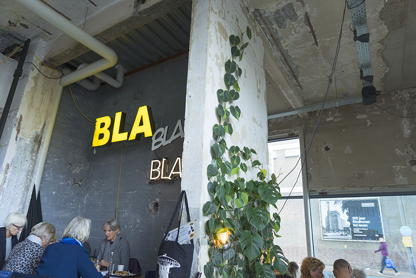
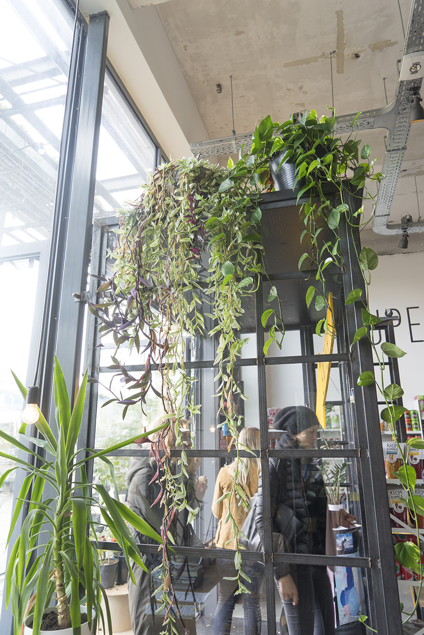
Oh before we head to the next design spot, let’s have a coffee break, right? Let’s pick a spot with nice plants – we found this one and loved it big time: Onder de Leidingstraat is a über-cool deli and café in the hip Strijp area.
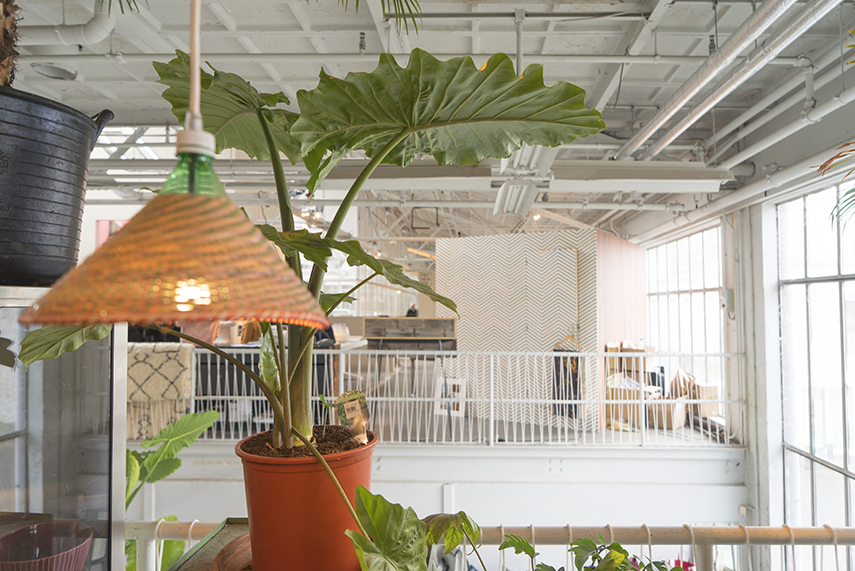
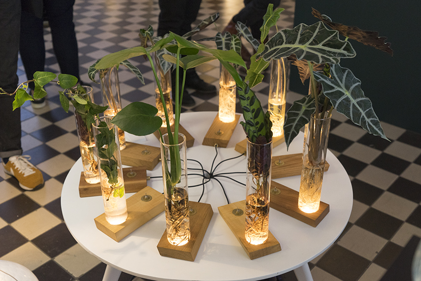
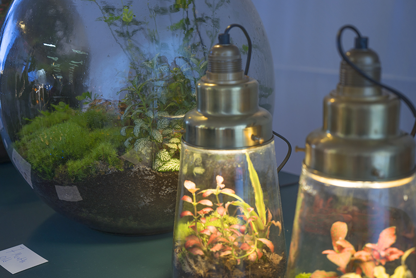
One of our personal highlights was the work of the yound Dutch design label Spruitje. Igor actually owns one of their first designs – a terrarium lamp in his home, you can see it on Happy Interior Blog. Their latest design is a fantastic propagation lamp with a wooden base, a brass switch, and a sleek glass tube. The lamp has an integrated LED lamp in the base so that the glass tube is illuminated from the bottom. This helps your cuttings to root quicker and look even more stylish in your home. Don’t you agree?!
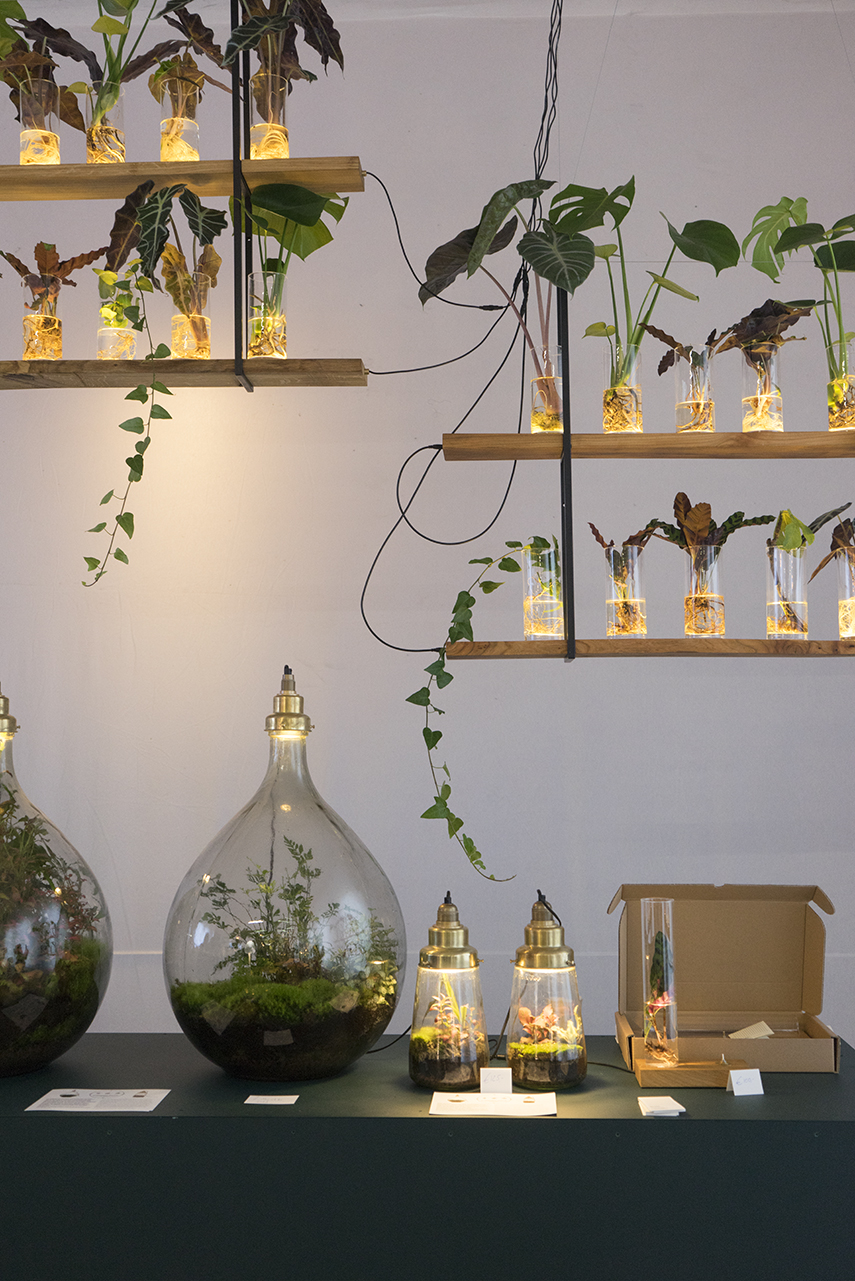
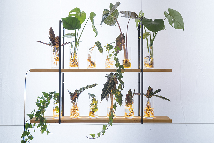
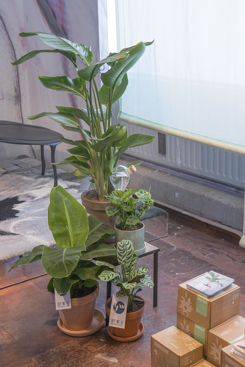
In the same area we spotted a few more green design highlights. The folks of House of Thol presented their designs, among them their self-watering solution Waterworks. This device is also mentioned in our Urban Jungle book as a solution for easy plant watering. It is not only practical though, it also looks pretty ace: a combination of glass, partly glazed terra-cotta, and a cork stopper.
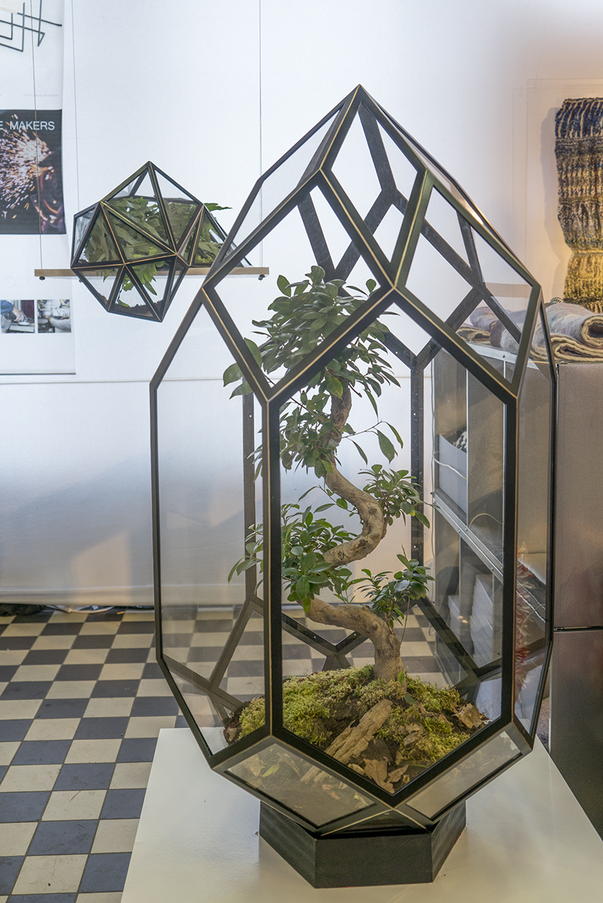
More green findings: How about a giant glass terrarium? If you have a humongous Bonsai or any other terrarium plant, opt for the giant terrarium called Terra by Sanne Weekers. Pretty impressive!
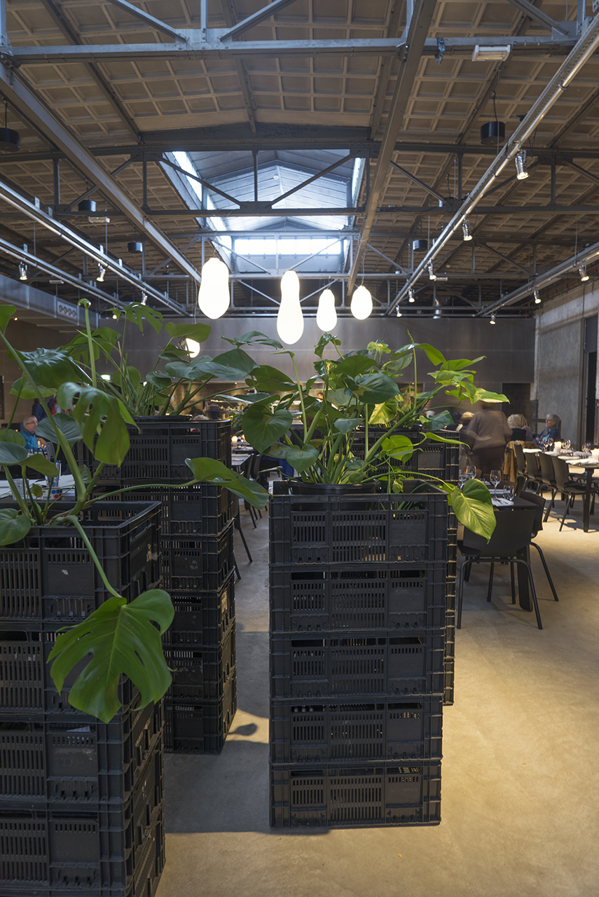
Ok it is time for another break! We need lunch. So let’s pick a restaurant worth an Urban Jungle Bloggers visit! How about these two options: Kazerne is a very cool and urban space set in a vast hall that combines both, a restaurant and exhibition space. We liked the food of course but we LOVED the plants set in crates and on the counters adding a wild touch to the industrial space.
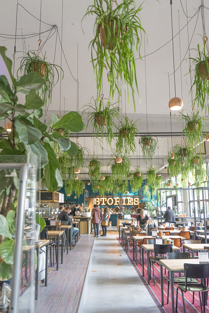
Another lush spot in town is Stories Eindhoven. Just look at the following picture – do we need to add more words to it? The hanging cacti (Lepismium and Rhipsalis) are just stunning in this restaurant! Definitely a show stopper!
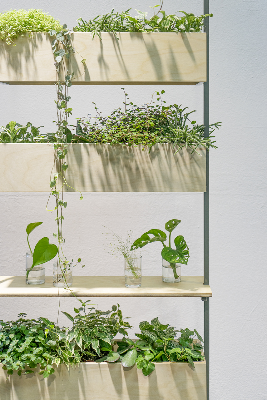
Let’s continue with green design now. We had a little green love affair with the new shelving units by Rotterdam based designer Femke de Witte of Nord Interior Design. Her plant shelf is a perfect addition to any urban jungle offering plenty of space for all kinds of houseplants or even herbs when placed in a kitchen. The contemporary look is accentuated by clean lines and the use of pure plywood and steel.
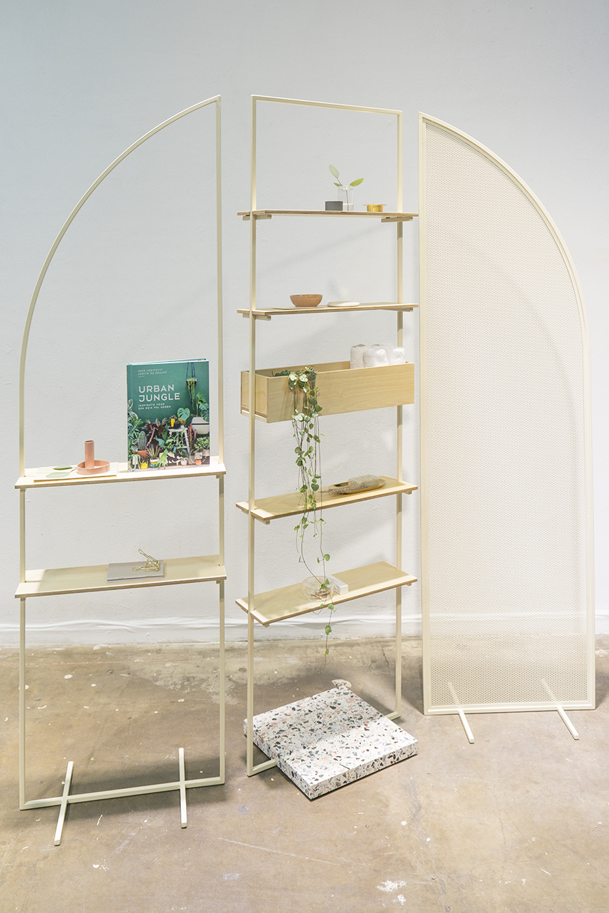
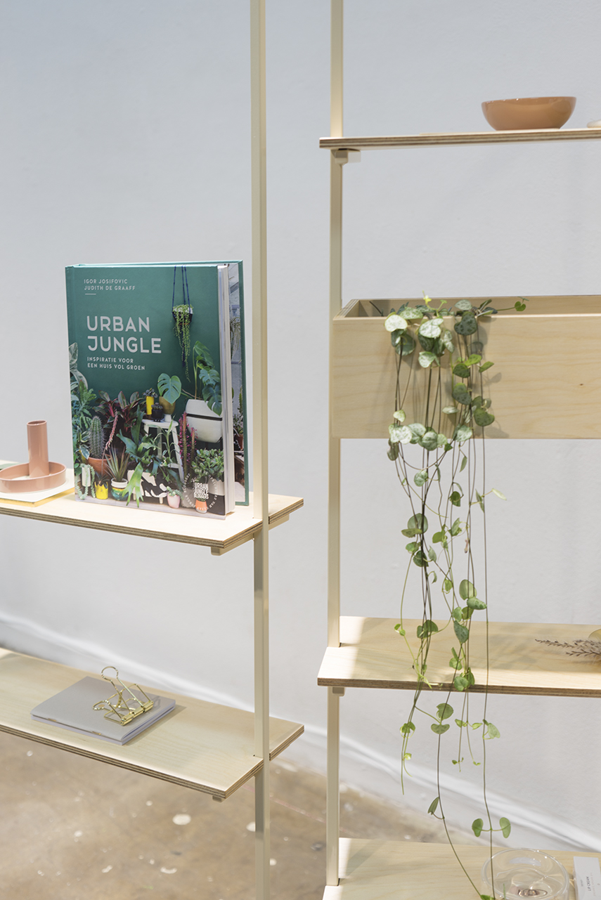
Another fabulous design from Nord Interior Design is the room divider slash shelving unit. With its organic arch shape it recalls the roaring 1920s, yet its overall look and feel is very contemporary. This was presented as a first prototype but we see a lot of potential for this one, don’t you think so? Eventually the three parts will be connected and this divider will come in handy to separate ares in open space interiors or small homes. Thumbs up!
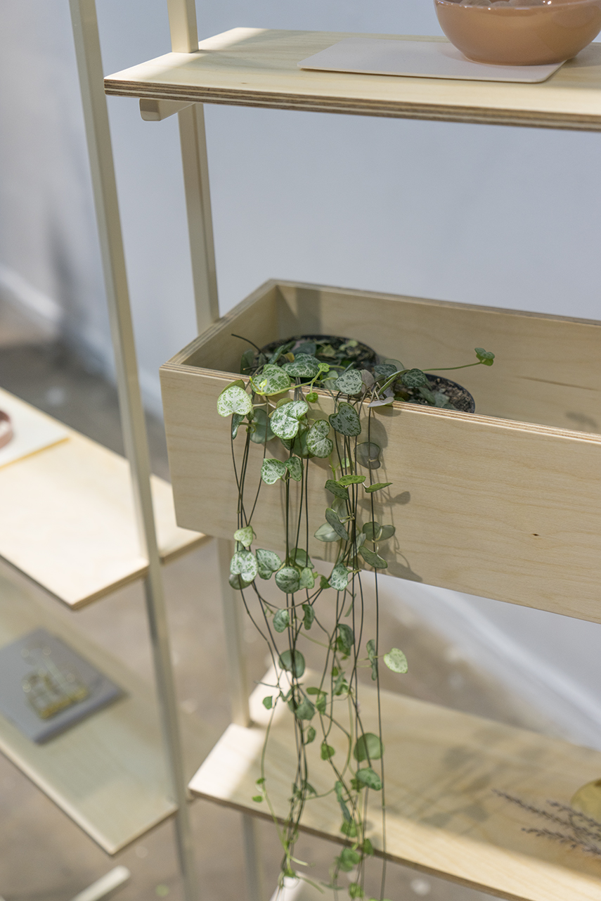
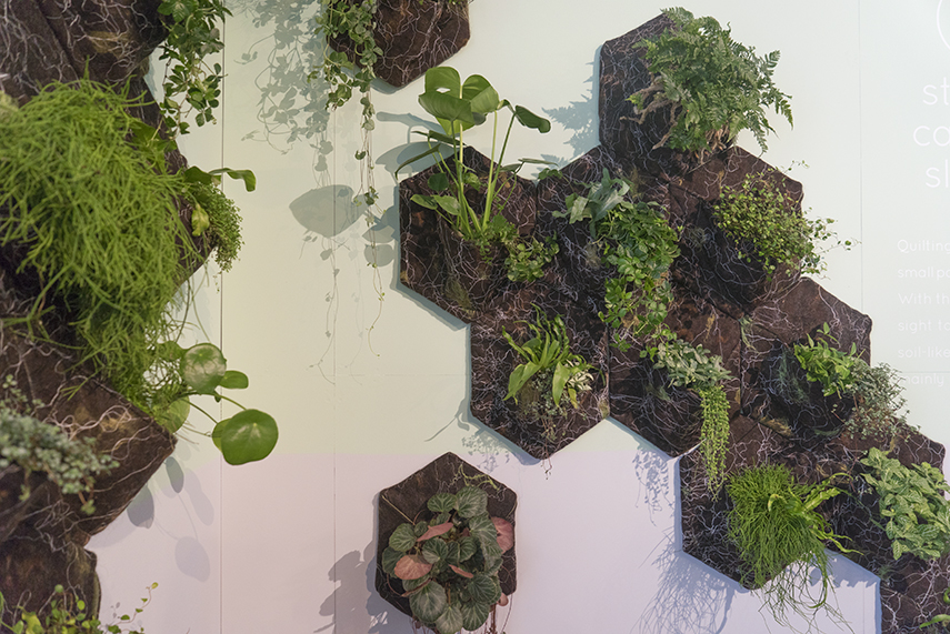
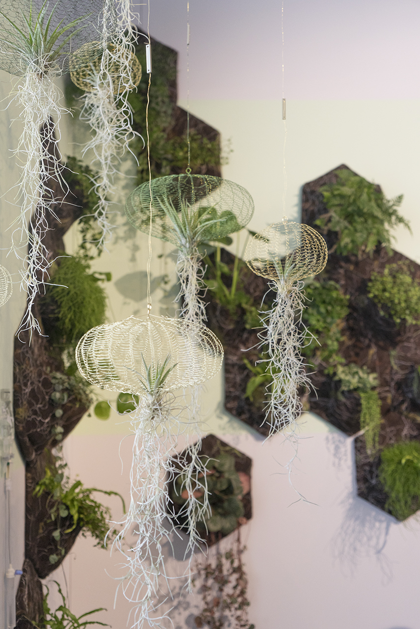
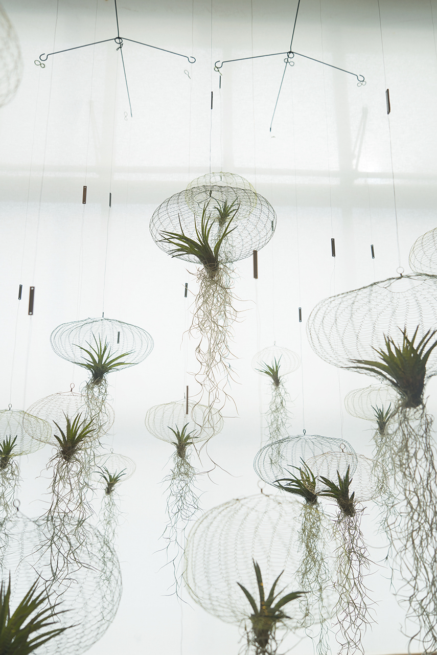
Studio Carolijn Slottje was also present at the Dutch Design Week. Besides her well known floating air plant medusae, she presented her new Garden Quilt project. It is a creative way to add a green wall – whether in small for a home or as a larger installation for public places.
We hope you enjoyed the little green design tour brought to you from Eindhoven in Holland. The Dutch Design Week tour was organized by our fellow bloggers and friends Holly Becker of decor8 and Desiree Groenendal of Vosgesparis. Thank you both for a fabulous weekend!
Photography by Urban Jungle Bloggers
